
Introduction
The web design industry is constantly evolving. Every new year brings a lot of trends, which promise to be blazingly fast and, most importantly, better than the others. It's hard to see through everything that's out there. And it's rare to see a methodology or a technology stand the test of time, especially when measured in years. This year we're celebrating the tenth anniversary of Atomic Design methodology - it's like a century in terms of technology. How did it stay for such a long time on the market? How did we use it? And is it still relevant? We'll answer all these questions in this article.
What's Atomic Design anyway?
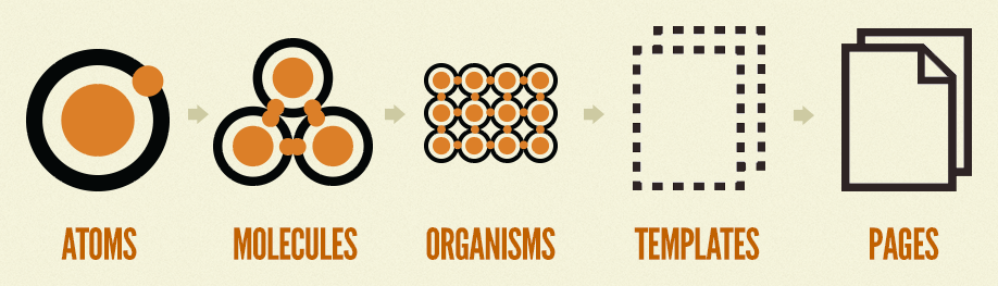
Firstly, let's get to know this methodology and its origin. While searching for a source of inspiration, Brad Frost kept on coming back to chemistry. The base element of all matter is an atom. And the more of them we have in one place, the bigger the organisms we can create with them. Now let's move it to the world of front-end development: we can split all the building blocks of a website's graphical interface into the most atomic elements. And with those blocks, we can build more complex ones. This cycle repeats until we have a fully functional webpage to fill with data.
For a more detailed description of Atomic Design, look at Brad Frost's first blog entry about that subject.
Long live the king!
Google Trends says that (as of early April 2023) the "atomic design" phrase has been in its peak popularity since its introduction in 2013.
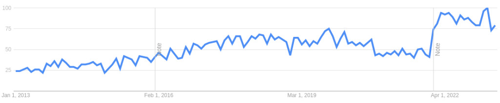
Even though those results might intertwine with all the other "atomic design" ideas, it still shows that such a thought is widely accepted & deemed popular.
Let's see how it compares with other popular methodologies on Google Trends.
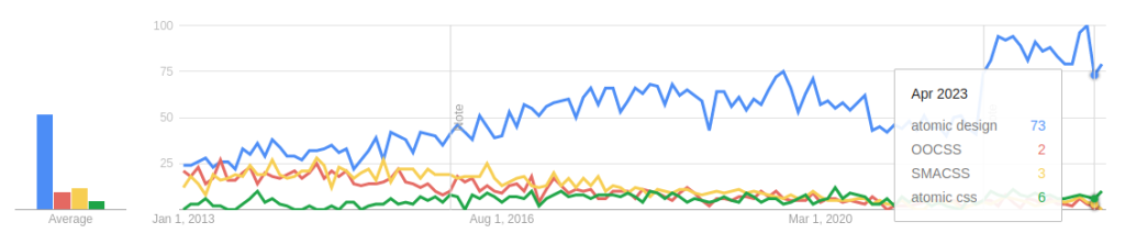
The graph above shows that older CSS methodologies are getting less and less popular with time, while Atomic Design seems to be here to stay. But let's compare it with probably its grandest competitor on the market - the BEM methodology.
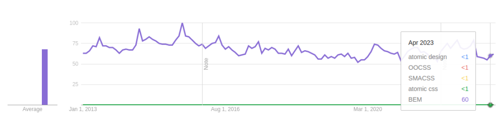
The results show that BEM is still the biggest kid on the block. It beats Atomic Design in popularity, but does it achieve that in other fields as well? Let's put both methodologies against each other and see which will emerge victorious.
Block. Element. Modifier.
As the getbem.com website mentions, using the BEM methodology means that we're dealing with three separate concepts:
- Block - a meaningful entity that can exist on its own
- Element - part of a block that does not convey a semantic meaning on its own
- Modifier - property of a block or element, which defines their variants
There's not much to it, so it's relatively easy to follow, even without a parallel like the one in the Atomic Design. Having just a few rules can be useful if we'd like to introduce that convention to any team - the easier the methodology is to understand, the faster we can get to greater website-building speeds. Unlike the Atomic Design, these concepts also come with a naming convention in the form of CSS class selectors:
.block__element--modifierAnd here's an example HTML snippet using the BEM convention in the class element attributes directly from the mentioned website:
<form class="form form--theme-xmas form--simple">
  <input class="form__input" type="text" />
  <input
    class="form__submit form__submit--disabled"
    type="submit" />
</form>
As you can see, each element has a specific class name, which uses the BEM convention - the <form>
element is the Block part here, and the <input> elements are the Element parts.
The main problem of this convention is its verbosity - even though we receive a highly specifically named element to
style in CSS, from the example above, you can see that even in the case of a simple element, the CSS class name might
get lengthy.
Another issue might arise, just like in the case of any other CSS-selector-based methodology - namely, the name
clashes. For instance, if we have to create different form elements across the page, we want to create two similarly
named blocks starting with .form. Certainly, we can treat this issue using modifiers, but having too many
of them might make them harder to track down and change if needed. Another solution might be to change the base name
of the block to something different, like .sign-in-form and .feedback-form. This solution
solves the previously mentioned issue, but the class names are getting longer.
Although this convention has a few issues, it does many things right. The CSS class naming convention is very easy to read - the B, E, and M parts are divided with underscores and dashes. Its three main concepts are easy to follow, which makes it more accessible to beginner & advanced developers alike. No wonder it got so popular over the years.
Now with added A!
As mentioned, the BEM naming convention might create bloated HTML files. A plethora of attempts have been made to improve it throughout the years. One of those attempts is ABEM - a combination of BEM & Atomic Design principles. And its main rules are:
- Adding the Atomic Design prefix to the class name, in the form of letters a, m, and o, for atoms, molecules, and organisms, respectively
- Replacing kebab case naming with camel case to even better see the groupings of blocks & elements
- Replacing the fully specified modifiers connected to blocks or elements with separate classes whose names start with a dash symbol
So our previous
.block-name__element-name--modifier-nameTurns into
.[a/m/o]-blockName__elementName.-modifierNameEven though we're increasing the CSS specificity with a separate .-modifierName class, it does not
inherently mean we're doing something bad. We can avoid naming clashes here if we assign that modifier class name to
the block/element and not style it separately. Applying those rules to our previous <form> example would make it look like this:
<form class="m-form -themeXmas -simple">
  <input class="a-form__input" type="text" />
  <input
    class="a-form__submit -disabled"
    type="submit" />
</form>
It looks much cleaner, especially if we consider the modifier part. And we're also putting the Atomic Design elements in context.
Here's a link to the article on ABEM if you'd like to get into its details. It's the article that got me into Atomic Design. Thanks, Daniel!
The 4 D's of Atomic Design
The parallel Frost uses can easily apply to multiple science, technology, and life fields. And transferring it to the front-end development is a brilliant idea. Creating a design system where you convert some abstract ideas into defined blocks, with which you can build a website, eliminates thinking about the internal complexities of the blocks themselves and allows for extreme amounts of scalability and rapid development. Right?

The methodology is there; applying it inside a starting project is a great touch - it feels like creating small plastic bricks. And with those bricks, we can create much bigger things. We don't think much about their build quality when we take them into our hands. We just use them as they were created. However, sometimes the grand structures we make can fall apart. And for the sole reason of the bricks' build quality. Now let's get back to the front-end development world. The webpage might fall apart if we don't create the blocks well. Sometimes it's about not splitting components properly; sometimes, it's about missing error handling. Reasons for breaking are aplenty. But what can we do to avoid breakage? Here are a few tips on how we can approach that.
Decouple
Splitting atoms in nature can lead to very serious consequences. And the elemental parallel still holds here. We shouldn't split the atoms on the front end as well. Fortunately, the website won't blow up, but keeping this principle in mind guarantees success. We can easily translate the HTML elements into such atoms... and splitting those in two is quite hard. But sometimes, we tend to couple multiple functionalities into one element. And coupling might work well in cases like having a whole app in one file. However, it will become increasingly hard to manually and automatically test. Splitting a big blob of code into many smaller parts will make it easier to read, test and reuse. Loosening the coupling between the logic of the components will also play a big role here - it'll remove the burden of thinking about the plethora of dependencies. And reusing the building blocks is more than possible - it's obligatory! Having many small reusable components within the app diverts our attention from thinking about their inner workings to how they can be joined into bigger structures.
Decrease
Let's say we have a button component. It often consists of a text label and a clickable background element. But what if we wanted to create another button, but this time with an icon instead of a text label? And what if the third option comes - the text label beside the icon in a button? Having so many mostly similar components will become quite cumbersome to deal with. An easy solution would be to create just one button component. But rather than containing multiple pieces of logic inside of it, we could create a styled clickable container that can accept any other component on the inside. Decreasing the number of components will lessen the burden of finding the right component to do the job and make the components more universal.
But what if we want to introduce a button variant? Say, a button with no background. Having one component makes it very easy to modify and style. And all the buttons already in the app can remain the same! Having no defined naming convention like in the case of BEM, we're free to apply that any way we like it, be it through ABEM or any other styling approach.
Discuss & document
Of course, having too many small elements comes with a price, which will most probably overwhelm the developers initially. Also, understanding any methodology and applying its principles will take some time. So when starting a new project using the Atomic Design or introducing it into an existing one, we must remember two crucial things - discussion & documentation.
An introduction meeting for the team is one thing, but discussing & adjusting the ruleset is another. Setting a common ground will make the developers understand the project & the methodology better. Not only that, but they'll also have more impact on the project itself as they're directly involved in both code and the team surroundings.
Properly documenting the components is crucial to introduce a new developer to the project. It will also be useful when we want to create a good component library, which can then be reused in other projects. And looking through documentation more visually is more pleasant than digging through hundreds of lines of text. Storybook is an awesome example of a tool that could alleviate the creation of such documentation. Creating it might take longer, but technical and non-technical people could benefit from it and explore all the components themselves.
Enter the Tailwind
CSS methodologies can be very useful, but as time passed, new players started to enter the handling of the styling scalability market. Preprocessors, CSS frameworks, CSS modules, and CSS-in-JS are just a few. And not to mention the utility-first approach in frameworks like Tailwind CSS. Words presented on its website say we can "Rapidly build modern websites without ever leaving your HTML," and they ring quite true. Using mnemonically created class names, we can quickly create pretty-looking components. Here's an example from said website:
<div class="pt-6 md:p-8 text-center space-y-4">It can even handle the responsiveness out of the box (something we'd have to implement manually in Atomic Design or BEM). It seems legible, but knowing the meaning of pt and md might take some time. And let's remember Tailwind's main sore point - the class names might get even longer than in the case of BEM. Let's take a look at another example from the webpage:
<img class="w-24 h-24 md:w-48 md:h-auto md:rounded-none rounded-full mx-auto">Even though we're now very explicit about how this <img> element should look on desktop and mobile
devices, the HTML gets even more bloated. To prevent this from happening, we have to dive back into the CSS world -
the @apply directive might help us with that:
.img-avatar {
  @apply w-24 h-24 md:w-48 md:h-auto md:rounded-none rounded-full mx-auto;
}
But wait a second! Aren't we back to square one? We're just writing CSS, but slightly differently! That's quite
right. And that's one of the reasons the authors of Tailwind discourage a premature usage of @apply just
to make things cleaner - creating a wrong abstraction, coming up with class names, and jumping between the files to
modify the styling will make the developer experience more exhausting.
So how can we make the styling more reusable? We can, for instance, leverage the JS frameworks to extract the code pieces into separate components and keep the styling inside of the component itself. And to manage such components, we can use the Atomic Design principles - splitting them into atoms, molecules & organisms seems to be a breeze. Consistent styling is quite to achieve through theming provided by the Tailwind framework. And there's no need to create a conjoined version of methodologies. While taking this approach, Tailwind and Atomic Design might complement each other - we use the directory structure to handle the Atomic Design split and handle the styling through Tailwind separately. A match made in heaven!
Look at the reusing styles section of Tailwind documentation for more details.
So is Atomic Design still relevant in 2023?
Having a methodology in a project always comes with the cost of understanding and using it properly. Creating simple website building blocks with Atomic Design in mind is a great opportunity to unlock the potential behind building with them instead of thinking over the underlying code.
While considering the utility-class approach, we might ask ourselves whether we're approaching the brink of CSS methodologies extinction. And the answer is: not really - methodologies comprise general ideas which are universal and timeless. And good ideas tend to come back to life after they've been abandoned for some time (I'm looking at you, functional programming).
Many other solutions for styling scalability handling appeared throughout a decade of Atomic Design's existence. However, the ideas behind this methodology stood the test of time - we can successfully apply them to other CSS methodologies like BEM or other styling approaches like the utility-first approach in Tailwind CSS, and it will remain consistent.
The chemistry parallel brought up by Frost is simple and easy to understand because it's directly inspired by the world surrounding us. And as long as atoms do look & behave as they do in our universe, the parallel will continue to be relevant.
Atomic Design is a great starting point, but remember that every methodology is just a set of rules we put on ourselves. And there's no harm in changing the rules.